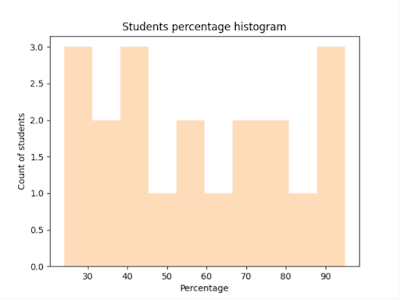
Histogram provides a graphical or visual summary of the count of values within specific intervals known as bins.
Example
In a histogram:
a. Horizontal axis specifies the range of values in your dataset, called as bins.
b. Vertical axis specifies the frequency or count of occurrences for each bin.
In this example, the data is grouped into bins: [0-30), [30-40), [40-50), etc. The height of each bin represents the frequency or count of values falling within that bin.
hello_world.py
import pandas as pd
import matplotlib.pyplot as plt

students_percentage = [71, 25, 34, 95, 45,  81, 76, 45, 31, 65, 89, 56, 78, 45, 56, 90, 32, 24, 46, 69]
plt.hist(students_percentage)

plt.xlabel('Percentage')
plt.ylabel('Count of students')

plt.title('Students percentage histogram')
plt.show()
Output
Customize the color of bins
By specifying a value to the color parameter, we can customize the bins color.
plt.hist(students_percentage, color='#fedcba')
Above statement generate below histogram.
Customize number of bins
By specifying bins parameter, we can customize the number of bins.
plt.hist(students_percentage, color='#fedcba', bins=3)
Above snippet generate below histogram.
In this example, the bins parameter is set to 3, resulting in a histogram with 3 bins. The data is divided into intervals of equal width, and the heights of the bars represent the frequency of scores within each bin.
Set different colors to each bin
The hist() returns three values:
a. n: An array containing the frequencies or counts of values in each bin.
b. bins: An array containing the edges of the bins.
c. patches: A list of individual bar objects representing the bars of the histogram.
diff_color_to_each_bin.py
import pandas as pd
import matplotlib.pyplot as plt
import random

def random_hex_color():
    # Generate random values for red, green, and blue components
    red = random.randint(0, 255)
    green = random.randint(0, 255)
    blue = random.randint(0, 255)

    # Convert the values to hexadecimal and format the color string
    color_string = "#{:02X}{:02X}{:02X}".format(red, green, blue)
    print(color_string)
    return color_string

students_percentage = [71, 25, 34, 95, 45,  81, 76, 45, 31, 65, 89, 56, 78, 45, 56, 90, 32, 24, 46, 69]
n, bins, patches = plt.hist(students_percentage, edgecolor='white', linewidth=1)

total_bins = len(patches)

for i in range(total_bins):
    patches[i].set_facecolor(random_hex_color())

plt.xlabel('Percentage')
plt.ylabel('Count of students')

plt.title('Students percentage histogram')
plt.show()
Above application set different random color to each bin. For example, following is the sample plot.
Display frequency or count of bin
Using annotate method, we can display the frequency of each bin directly on the histogram plot,
Example
for i in range(len(n)):
    plt.annotate(f'Freq: {int(n[i])}', xy=(bins[i] + (bins[i + 1] - bins[i]) / 2, n[i]),
                 xytext=(0, 3), textcoords='offset points', ha='center', fontsize=8, color='black')
display_frequency.py
import pandas as pd
import matplotlib.pyplot as plt
import random

def random_hex_color():
    # Generate random values for red, green, and blue components
    red = random.randint(0, 255)
    green = random.randint(0, 255)
    blue = random.randint(0, 255)

    # Convert the values to hexadecimal and format the color string
    color_string = "#{:02X}{:02X}{:02X}".format(red, green, blue)
    print(color_string)
    return color_string

students_percentage = [71, 25, 34, 95, 45,  81, 76, 45, 31, 65, 89, 56, 78, 45, 56, 90, 32, 24, 46, 69]
n, bins, patches = plt.hist(students_percentage, edgecolor='white', linewidth=1)

# Add frequency annotations to the histogram bars
for i in range(len(n)):
    patches[i].set_facecolor(random_hex_color())
    plt.annotate(f'Freq: {int(n[i])}', xy=(bins[i] + (bins[i + 1] - bins[i]) / 2, n[i]),
                 xytext=(0, 3), textcoords='offset points', ha='center', fontsize=8, color='black')

plt.xlabel('Percentage')
plt.ylabel('Count of students')

plt.title('Students percentage histogram')
plt.show()
Output
In the above example, I loop through the ‘n’ array containing the frequencies for each bin. For each bin, I applied the annotate() function to add a text annotation with the frequency value.
a. The xy parameter specifies the position of the annotation, and
b. xytext specifies the offset from that position.
c. textcoords='offset points' parameter indicates that the offset is given in points.
d. ha='center' used to center-align the annotation horizontally within the bar.
e. I adjusted the font size and color of the annotations for better visibility using fontsize and color parameters.
Previous Next Home


No comments:
Post a Comment