This post is a continuation of my earlier write-up, where I configured Prometheus with three monitoring targets:
· Prometheus (to monitor itself)
· Grafana
· Node Exporter (to collect system-level metrics)
Prometheus is set up to periodically scrape metrics from each of these targets, storing them for visualization and analysis.
In this part, I’ll walk you through the process of creating a custom dashboard in Grafana using the metrics collected by Prometheus. We'll visualize CPU usage, memory, and other system-level insights to better understand the health and performance of our monitored environment.
Follow the step-by-step guide below to begin building your own customized Grafana dashboard.
Step 1: Accessing Grafana and Creating a New Dashboard
Open Grafana in your browser by navigating to http://localhost:3000/
(Assuming Grafana is running locally on your machine.)
Log in using your credentials. Default credentials (if you haven't changed them):
· Username: admin
· Password: admin (you’ll be prompted to change this on first login)
Once you're logged in, look to the left-hand navigation panel and click on “Dashboards”. This will take you to the Dashboards listing page, where all your existing dashboards are listed.
To create a new dashboard:
· Click the “New” button located in the top-right corner of the dashboard listing page.
· Then, select “New Dashboard” from the dropdown menu.
At this point, you’ll be taken to a blank canvas where you can start building your custom dashboard by adding new panels and visualizing metrics collected from Prometheus.
Click on ‘Add visualization’ button. You can select the data source from the here.
Select prometheus for now, You can even build a dashboard that consumes data from multiple data sources.
You will be taken to Visualization editing page.
Write the Query as up in Metric section and click on Run queries button.
Once you run the query, Grafana will send the query to Prometheus and retrieve the latest time series data for the up metric, and display the results visually in the graph preview area.
From Panel right side, you can see an option to set the title to this panel. I set the name as ‘Prometheus Targets Health’
Click on Time series button available in above image to customize or choose the visualization that suits to the ‘up’ query.
Search for Gauge, and select Gauge chart.
Chart is updated like below.
Right now the legend to each gauge are not clear. Let’s set the job names to respective gauges.
Expand the options in query panel.
Click on legend drop down.
Choose the option Custom.
Set the legned values are {{job}}.
You can observe that the graph is changed like below.
Click on ‘Save dashboard’ button to save the dashboard. It open Save dashboard form. Give the dashboard title as ‘hello-world’.
Click on Save button. Upon saving the dashboard successfully, you can see the dashboard like below.
Let me resize the panel.
Add this panel to a category
Right side of the dashboard you can see Add drop down -> Row
With this it adds a row above the panel.
Hover on ‘Row title’, you can see a settings icon. Click on settings icon.
It opens Row options form.
Give the Title as ‘Targets Health’, and click on Update button.
Upon updating of row title, dashboard looks like below.
Let’s add new panel to work with node_exporter target.
Click on Add button -> Visualization
It opens Visualizaiton panel like below.
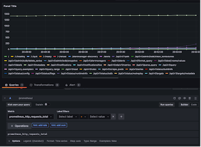
Let’s give the metric as prometheus_http_requests_total and click on Run queries button.
Let’s give the panel names a Total Requests. Save the dashboard.
Dashboard looks like below.
Let’s add one more row ‘HTTP Requests’.
We can rearrange the rows by simply drag and dropping.
Let me add one more panel
· Set the query as ‘prometheus_http_request_duration_seconds_sum’, which tells the request latencies.
· Set the legend as {{handler}}
Click on Run queries button. You can see the visualization like below.
Save the dashboard.
Dashboard looks like below.
Move the dashboard to HTTP Requests row.
Let me create a visualization with three queries
a. node_memory_active_bytes
b. node_memory_total_bytes
c. node_memory_compressed_bytes
Give the legend as {{__name__}} for all these queries to print the query name in visualizaiton.
Add another visualization with following queries
a. node_cpu_seconds_total{mode="idle", cpu="0"}
b. node_cpu_seconds_total{mode="nice", cpu="0"}
c. node_cpu_seconds_total{mode="system", cpu="0"}
d. node_cpu_seconds_total{mode="user", cpu="0"}
Give the legend as {{mode}}
Give the visualization title as Seconds the CPU-0 spent in each mode.
Save the dashboard.
Create another Row ‘System Metrics’. Add Memory Statistics and CPU stats to the ‘System Metrics’ row
Final Dashboard looks like below.
That’s it! Your dashboard now looks like the one above. Feel free to explore and experiment with it.
Previous Next Home


No comments:
Post a Comment