'grid-template-rows' property allows you to define the height of the rows in a grid container, providing a powerful way to control layout structure and spacing.
What is grid-template-rows?
The grid-template-rows property specifies the height of each row in a grid container. It accepts a variety of units and values, including fixed units like pixels (px), relative units like percentages (%), flexible units (fr), and even functions like min-content and max-content.
Syntax
grid-template-rows: row-height-1 row-height-2 ... row-height-n;
Each value represents the height of a corresponding row. If there are more grid items than specified row heights, the additional items will be placed in auto-generated rows.
Following are the different ways to specify row height.
1. Absolute Length Units
Pixels (px): Specifies a fixed row height in pixels.
grid-template-rows: 100px 200px;
Other Absolute Units: You can also use other absolute length units like cm, mm, in, pt, pc, etc., though they are less common in web design.
grid-template-rows: 1in 2in;
2. Relative Length Units
Percentage (%): Sets the row height relative to the height of the grid container.
grid-template-rows: 50% 50%;
3. Fractional Units (fr)
Flexible Fraction (fr): Allocates a fraction of the remaining space in the grid container. The fr unit is highly flexible and commonly used to create responsive designs.
grid-template-rows: 1fr 2fr;
In this example, the second row will be twice as tall as the first row.
4. Auto
auto: The row height is determined by the content inside the grid item. The row will expand to fit its content.
grid-template-rows: auto auto;
5. min-content and max-content
min-content: Sets the row height to the minimum size required to fit its content without overflowing.
grid-template-rows: min-content;
max-content: Sets the row height to the maximum size required to fit its content, potentially causing overflow.
grid-template-rows: max-content;
6. minmax() Function
minmax(min, max): Defines a row height range with a minimum and a maximum. The row will be at least min and no more than max.
grid-template-rows: minmax(100px, 300px);
7. repeat() Function
repeat(count, size): Repeats a specified row height a given number of times.
grid-template-rows: repeat(3, 100px);
This creates three rows, each 100 pixels high
hello-world.html
<!DOCTYPE html>
<html lang="en">
<head>
    <meta charset="UTF-8">
    <meta name="viewport" content="width=device-width, initial-scale=1.0">
    <title>CSS Grid Example</title>
    <style>
        .grid-container {
            display: grid;
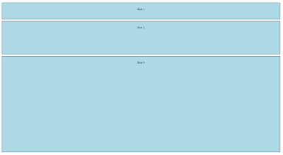
            grid-template-rows: 100px 200px 1fr;
            gap: 10px;
            height: 90vh;
            margin: 20px;
        }

        .item {
            background-color: lightblue;
            border: 1px solid #000;
            text-align: center;
            padding-top: 30px;
        }
    </style>
</head>
<body>

<div class="grid-container">
    <div class="item">Row 1</div>
    <div class="item">Row 2</div>
    <div class="item">Row 3</div>
</div>


</body>
</html>
grid-template-rows: 100px 200px 1fr;
This sets the height of the first row to 100 pixels, the second row to 200 pixels, and the third row to take up the remaining space (using the fr unit).
gap: 10px;
This adds a 10-pixel gap between rows and columns in the grid.

No comments:
Post a Comment